


Language and Belonging
Exploring the Italian migrant's experience in Filomena Coppola's solo exhibition at Mildura Arts Centre

Five letters cinque lettere
Filomena Coppola uses symbols drawn from everyday migrant experience to explore the depths of belonging, family connection and Italian Australian identity. A body of work developed over ten years is on display at the Mildura Arts Centre. Five Letters cinque lettere refers to the five letters present in the English alphabet but missing from the Italian one. This seemingly simple conceit opens up conceptual space to explore what it means to grow up between two cultures.
Coppola works primarily with pastels on large sheets of paper, often joined to create large scale works. Using layer upon layer of fine pigments, held in place with fixative, these drawings feature surreal combinations such as fur covered native Australian flora. These reflect her desire to depict her experiences ‘caught between cultural expectation and new opportunities’.[1] The viewer should be left with a sense of dislocation; she tells me as we walk through the gallery in mid-December.
Coppola’s process reflects elements of the migrant’s journey itself. We pause at her early works ‘Wallflower – Play with Me’ (2010) which feature the furry orchids. She notes that the way she draws has a sensation of the unknown, of investing without knowing the exact destination; much like many of the men and women who chose Australia while knowing nearly nothing about it.
In Coppola’s documentary film from 2013, ‘Mother Tongue’, filmed and edited by Robert Klarich, some of the interviewees describe not knowing the language or a single other person when they arrived. Newly arrived migrants knew nearly nothing of the flora and fauna, and some had never seen an image of the country. ‘Mother Tongue captures the enormity of this dislocation and imperative to make a life from scratch.
I ask Coppola why Australia? They knew it would be better; she tells me. Perhaps the similarities in climate also drew many Italians to Mildura, something familiar in a new place.
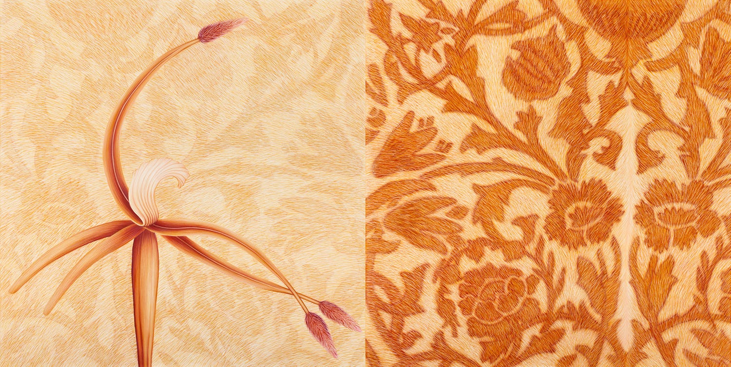
The surrealism of ‘Wallflower – Play with Me’ (2010) speaks to the strange new land her parents and many others experienced upon arrival. These furry orchids have an eye-catching texture, their shapes are not overly floral. Leopard print petals, a sort of sting ray shape, tiger stripes; are these plants or animals? I’m not quite sure.
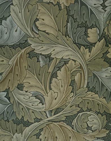
Mildura Arts Centre’s galleries are familiar to Coppola, she’s exhibiting on home soil. Back in 2011 for the Mildura Palimpsest Biennale #8 her work ‘Wallflower – Mirror rorriM’ was installed in a downstairs gallery. Two botanical pastels in light-and-reddish brown (over 100cm each) were hung above a sand and earth design carefully layered on the floor. Murray River sand and Mildura dirt (known for its rich fertile red-loam tinge) mapped out a large William Morris floral design – which viewers had to walk across to see the drawings up close. Once they did so it was clear the images were not quite what they seemed. A native Australian orchid and more William Morris designs are rendered like fur, in a strange and unexpected juxtaposition.
The audience’s footprints also transformed the floor design as they walked across it, in yet another nod to journeying and travel.
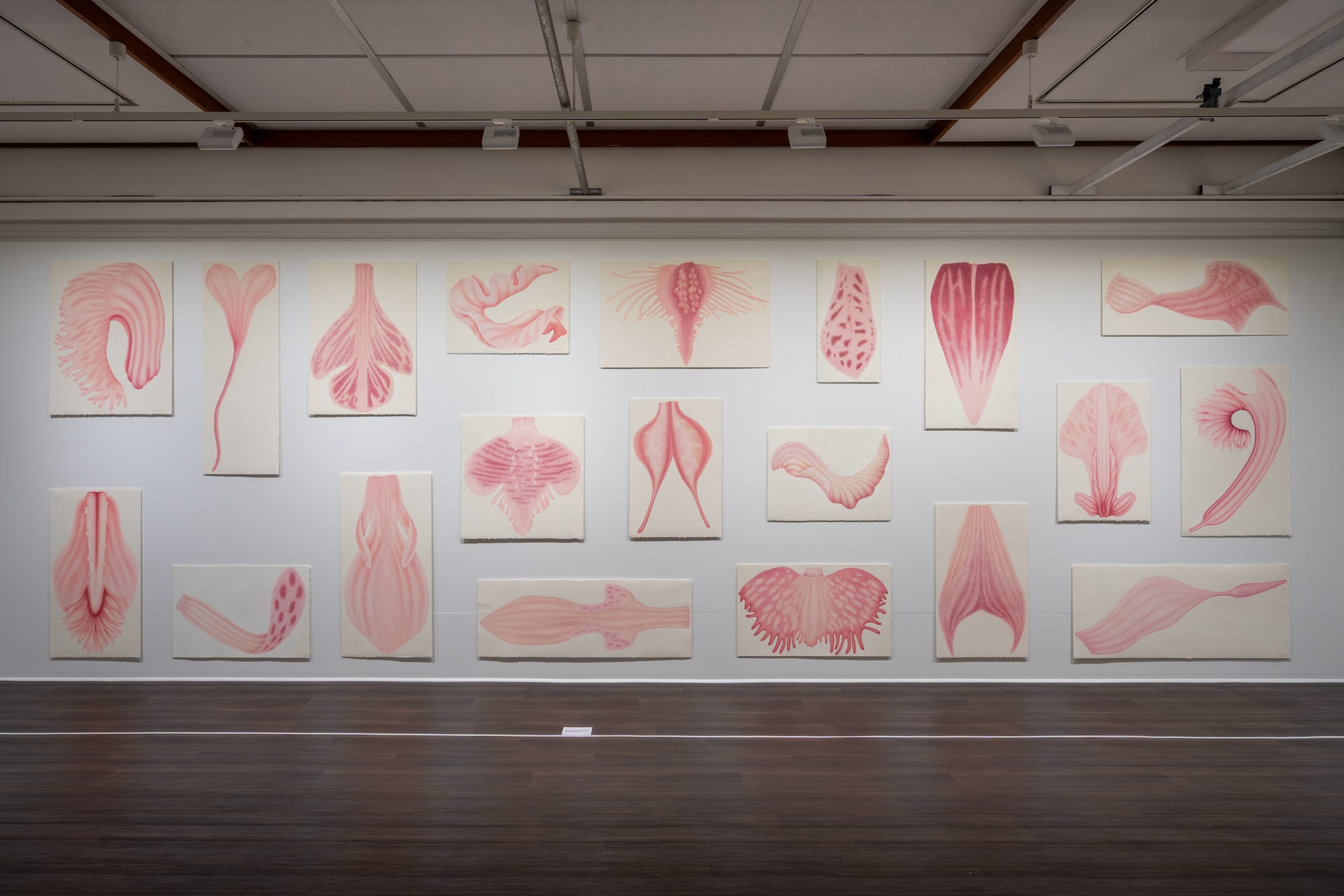
With five letters cinque lettere Coppola has once again carefully considered the space in which her artworks are displayed. ‘Wallflower – Mirror rorriM’ is this time hung next to other furry orchids from the same series. This series led to Coppola’s 2013 body of work ‘Mother Tongue’ which takes the botanical interest and creates a beguiling connection with Italy, the mother country.
‘Mother Tongue’ plays with scale, using blown up sections of the usually tiny orchids to map out Italy’s regions. Once again, the plants become animalian, tongue-like, and fleshy. Using a visual language perhaps known only to her, Coppola presents the 20 regions of Italy as light pink frilly orchid segments. The effect is incongruous. What are the connections between each orchid and each region? The tiny details and textures of the flowers draw the eye closer, and I stand before this wall of pink tongues absorbed by the questions arising about language and the repeated gap between signified and signifier.
A specific dialect is also a geographic marker, but these subtleties would have been invisible to Anglo-Australians meeting newly arrived Italians, like Coppola’s parents.
Coppola’s mother, Pellagrina, arrived in 1960 and father, Leonardo, arrived in 1955. They were from different regions and met in Adelaide before moving to Mildura where her father began growing grapes. They picked up the language as they settled into life in the inland. Speaking their mother tongue at home, something which is celebrated today as a useful skill, was viewed critically by Mildura society while Filomena was growing up.
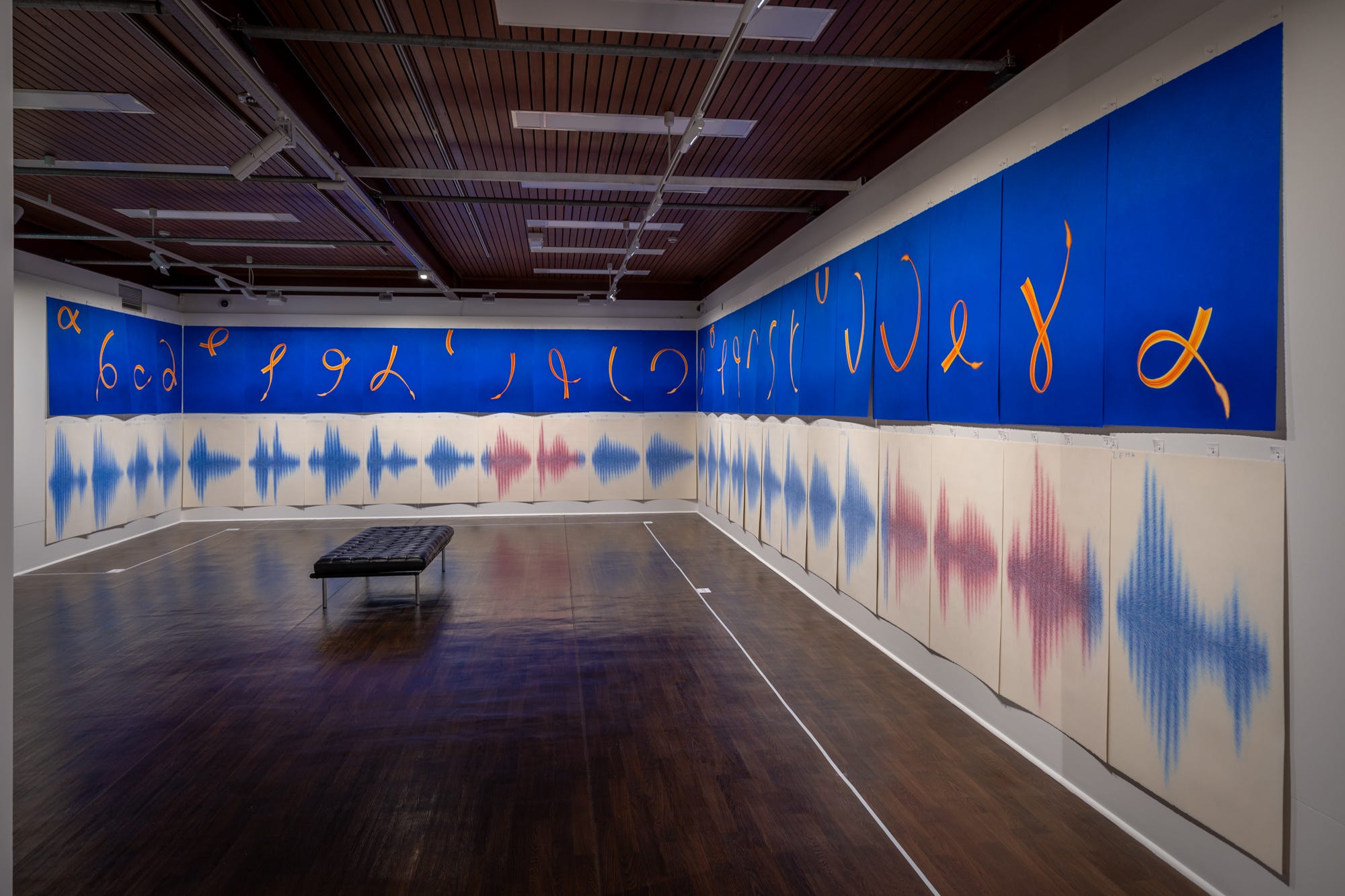
One of Coppola’s major works, ‘Alpha Sound’ (2014), takes questions of language and belonging in a new direction. It is composed of golden yellow and orange letters, but not as you would expect them. Their forms are derived from Coppola’s earlier exploration of Australian native orchid shapes. I initially viewed the exhibition in reverse, seeing these golden yellow shapes move across deep ultramarine backgrounds as though caught on a gust of wind. They’re like curvy stalks of wheat with a little tuft of seeds at the end.
The letters of the alphabet are unexpected shapes in gold on blue backgrounds. I immediately think of the alphabets circling the ceiling of my primary school classrooms, each letter featuring a namesake object or animal. The ‘A’ not always for Apple (my teachers were more imaginative than that) but corresponding logically for young minds to build a connection between the letter and the thing it names. This seems fitting when Coppola tells me that many in her parents’ generation are teaching the English alphabet to their grandchildren now, a positive experience for them the second time perhaps.
An audio work featuring the voices of locals saying the alphabets fills the gallery as we walk through. It has the quality of both a lesson and a dictation test. But I think I detect pride in the accents too.
Language learning, and the pressures this brings, are explored too in ‘Alpha Sound’, the colours chosen with reference to pedagogical blue and red ink. The red ink of the correction pen is reserved for those five letters not part of the Italian alphabet (J K W X Y). For Filomena and other migrants, who were questioned on their English proficiency because they spoke another language at home, the red pen is critical. It’s associated with schooling, doubts about language, the fear of getting it wrong. ‘Alpha Sound’ is about how we express ourselves, what our speech says about us and the community we belong to, Filomena tells me as we pause near the work.
Below each glowing letter are more large pastel pages, balancing the deep blue and bright golden with a white background. This time the focus of the sound of each letter is rendered from its recording. This series of vertical lines are depicted in soft fuzzy layers of blue, with the eponymous five letters in red to contrast. The letters above each red sound are a deeper orange to set them apart. The building blocks of language are presented as audio made visible as though the space between the two alphabets can be reconciled by the viewer.
The backgrounds of each letter are almost imperceptivity patterned with a William Morris print. It’s possible to miss these faint layers of pastel. Morris is a signifier of colonial residue and White Australia’s own origins within Coppola’s work. His quintessentially English patterns are used in several of her works to describe the story of British cultural assimilation in Australia. The grape vine motif used by Morris resonates in Mildura’s agricultural origins, while the Acanthus leaf links to the Corinthian columns of Ancient Greece, indicating the spread of ideas across time. Coppola is interested in how these references form a visual language which traverses the centuries.
If we are to make sense, somehow, of the dislocation experienced by migrants, the space between arriving and belonging, represented by the gap in language that many people experience upon arrival, Coppola’s exhibition suggests we must get comfortable with liminality. In ‘Alpha Sound’ the viewer draws connections between the new shapes of the re-imagined alphabet, uniting two languages. Unless we are sound engineers, we may not hear the sound of each letter while looking at their audio marks. The vertical lines are a language of their own and their shapes are as foreign to me as another language. The result of this double alphabet is an experience of dislocation, of seeking meaning using incomplete ingredients. The in-between space is where the answers could be.
Engaging with the Italian diaspora community is an important part of Coppola’s practice. For ‘Alpha Sound’ family names appear under each letter, clustered around the ‘C’ and ‘D’ (Carrazza, Coppola, di Pieri and so on, gradually added during the course of the exhibition), instead of objects or animals this alphabet denotes families who have made Mildura their home since the 1950s.
Nearby are two small but precarious towers of teacups and saucers. ‘The Weight of my Culture’ (2018) makes explicit the time with family, drinking coffee, the smell of the Bialetti brewing, conjured both by the title and the patterns of these small cups the artist has collected from relatives.
There are many connections and conceptual patterns running throughout this exhibition, but it is never flippant or irreverent about the experience of people who left behind everything they knew to forge a new future. I was struck listening to their accounts; how little they knew of the place they had chosen to make their home. Often with zero experience of the English language, no reference to a map or the environment. Using family connections where available they settled near cousins or set out to Mildura with barely a look at Melbourne. Migrants might laugh about how hard it was at the time, but I feel from Coppola’s artworks the weight of this subject for her. Some of the loss is physical: grandparents hardly known; family members lost. Some is more intangible: the loss of and transformation of culture through the migration process.
Smaller pastel works also explore loss and once again take inspiration from the natural world. ‘In my Father’s Garden’ (2024) is a series mourning the artist’s father while combining many of her well-known thematic interests. Beautifully detailed insects from Leonardo’s garden, including an unexpectedly sympathetic mosquito, feature on a soft Morris-esque background with words in Italian and English denoting a theme. The mosquito is blood sangue. A lady beetle is paired with love amore while the grass hopper is earth terra. Using pencil this time, Coppola’s fine touch takes the viewer into a decorative but meditative space where the encounters in our garden with bugs, even the annoying ones, are meaningful.
Pencil also features masterfully in a series of four small works about journeying and migration. From 2022 ‘The Journey (fire, air, water, earth)’ evokes the elements through abstract patterning, once again seeking a visual language to capture lived experience.
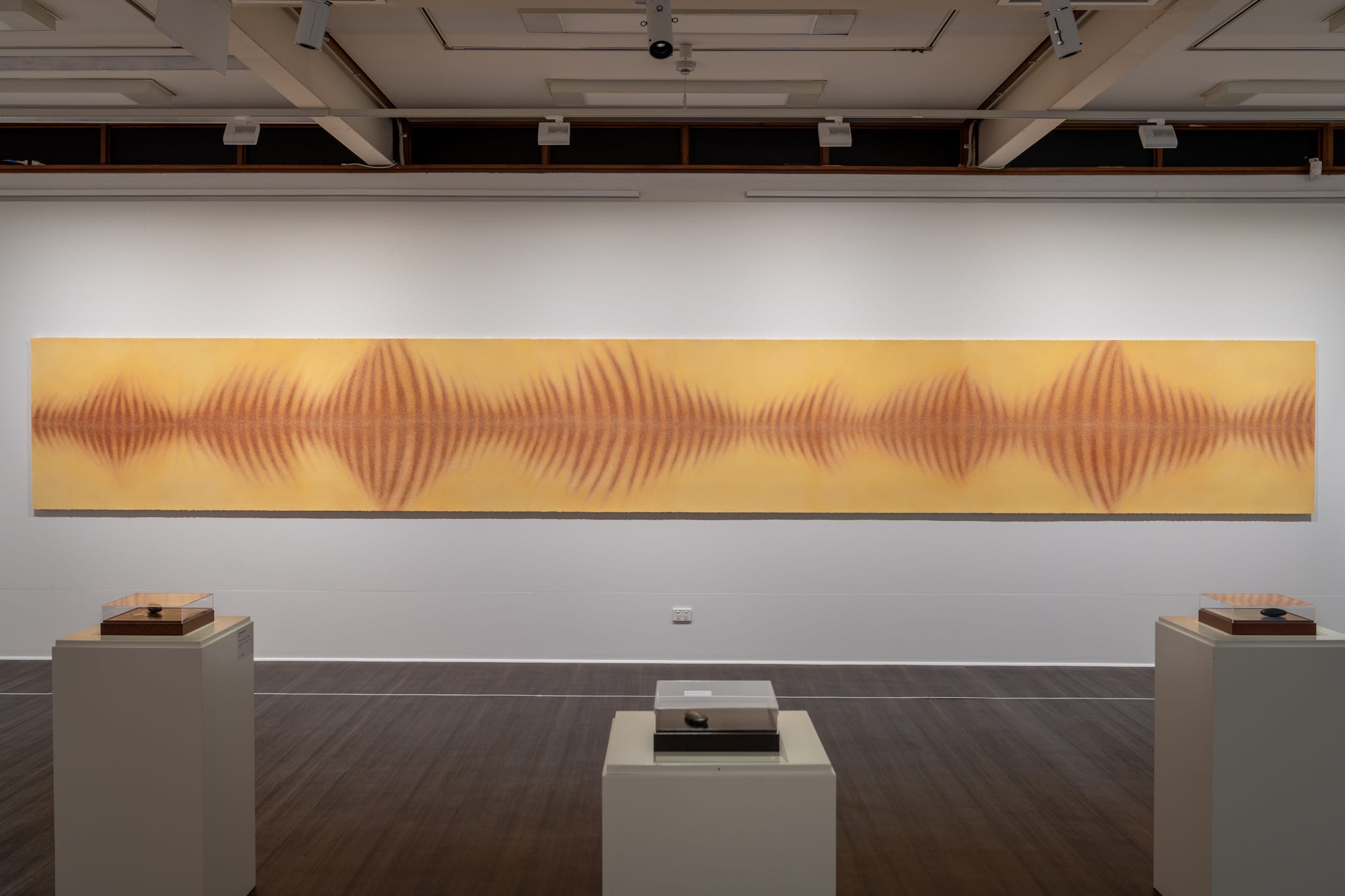
One last ambitious work completes this exhibition. ‘Chasing the Disappeared’ (2012) is an 8m pastel drawing. Referencing a Thylacine’s pelt, Coppola has used pastel to represent the furry texture in a light brown and golden palette. Stretching across the wall horizontally, the tiger’s stripes remind me of the audio symbols for letters in ‘Alpha Sound’. Alternatively protruding and receding, the vertical lines are full of movement. This pelt appears to exist as a kind of perfected representation of the back of the animal, both mythic and tactile at the same time. But we are also left without definite answers, once again, as the artist explores in-betweenness. Here we see just part of the animal, just their beautiful unblemished coat representing the passing of the first generation of Italian Immigrants which came to Australian in the 1950s. This cultural loss only really tangible after the fact. Like all of Coppola’s work I find it technically compelling and am left with questions to ponder.
Five letters cinque lettere is on display at Mildura Arts Centre 16 Nov 2024 – 19 Jan 2025. More images from the exhibition can be seen on the artist’s website.
[1] Exhibition catalogue, 1.
Thank you Nikita for this sensitive and exploratory review of Filomena’s exhibition. It’s enriching to read it and to be taken back to each work again. Liminality and in-betweenness are indeed pertinent themes of the migrant experience, brought to light by your analysis. The questions you raise also show that the global reality of leaving a homeland are worthy of repeated investigation and attempts to understand the process.
Thank you for exploring this exhibition, Nikita. The similarities of spoken language with visual art make such a wonderful conversation for expressing the changing textures of consciousness. A very engaging exhibition! Definitely gives us new ways of appreciating the immigrant challenges, as a picture of the human displacement woven into the fabric of the world. A very interesting article.